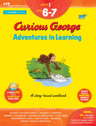
Curious George Adventures in Learning
Creative Director & Writer
Houghton Mifflin Harcourt wanted to create new Curious George activity books. I crafted the vision for a story-based workbook series—the first of its kind. Stories provide context for hundreds of learning activities, from STEM to social and emotional.
The deadline and budget were aggressive. To economize:
- I cobbled together art from 50 existing George books to create 30 fresh stories and 500 activity pages.
- I defined templates to expedite production.
- I directed the layout of each page to create a polished art-book style.
The interactive bits were pleasantly surprising in their complexity and potential for having meaningful conversations about things like social norms, ethics, and other topics that other books shy away from.”
—Amazon reviewer, parent
Achieve!
Creative Director & Writer
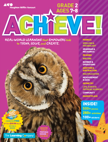
Houghton Mifflin Harcourt wanted to create a new consumer workbook series. To differentiate these in a packed market, I pitched the idea of making a magazine-style workbook, loaded with Nat Geo style pictures.
- A win-win for budget and design, I worked with permissions team to negotiate the use of an existing photo library at $0.
- Photos woke up learning activities. In testing, kids saw these as magazines first, dog-earing pages with fun pictures to visit later.
My favorite part of the workbook is the fact that there are so many “real” pictures/photos. My children are seeing what animals and people and things really look like, as opposed to illustrations of things. I just feel like they’re learning better by looking at photos.”
—Amazon reviewer, parent
Success
Taking the work out of workbook…
I JUST NEED TO DO A LITTLE MORE MATH!!!!!” —Henry, 6-years old


