UX Designer
The old paywall
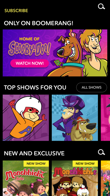
Boomerang is a paid cartoon streaming service. Visitors can explore the app, but all roads lead to a paywall.
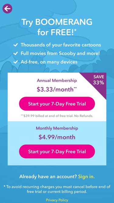
The original blue paywall was unpredictable. Tapping a show card (like Atom Ant) triggered it, cutting exploration short. A non sequitur, it prompted visitors, Which plan do you want?
Design and learn
To resolve, I reframed paywall as a conversation, not an obstruction. The new paywall would be:
- Predictable. Adding lock icons to premium content removes the element of surprise.
- Triggered at moment of greatest want, when a visitor tries to play a locked cartoon.
- Aware of visitor intent. Want to start watching? Yes or no?
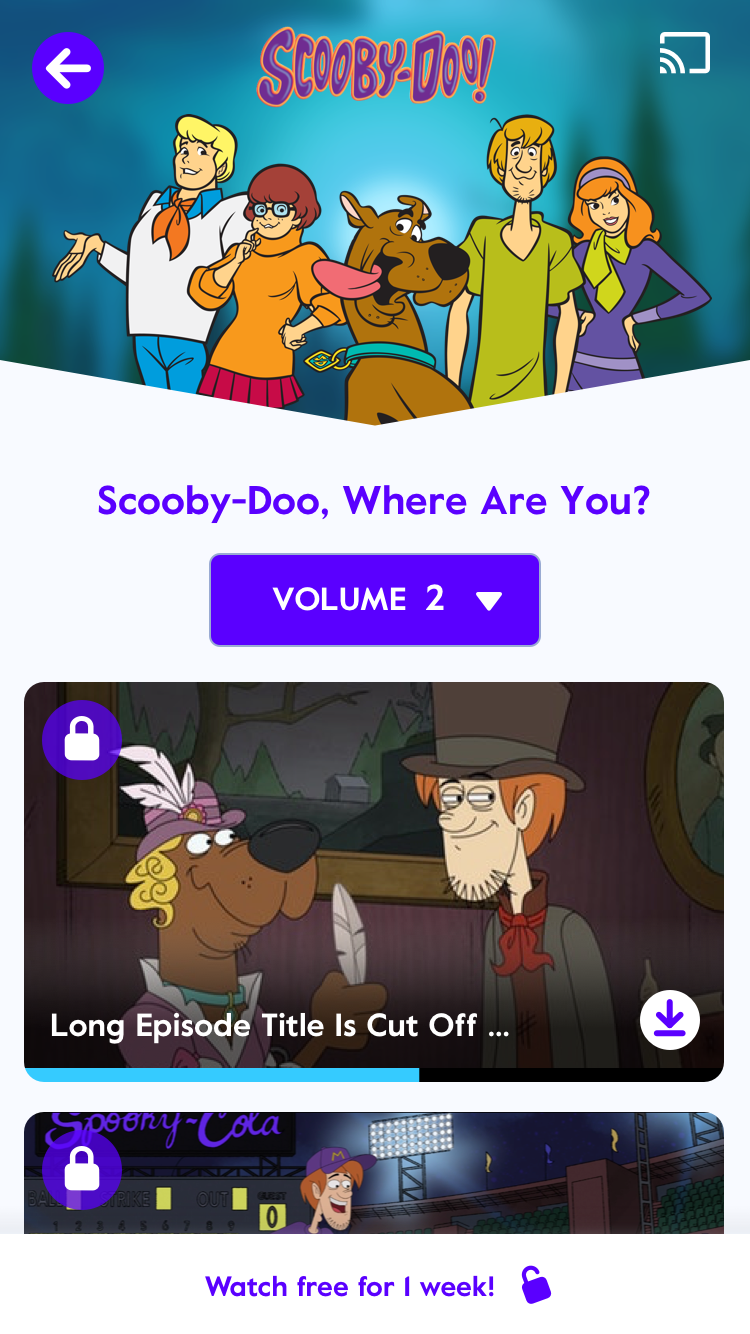
In place of the blue paywall, a micro banner appears at the bottom of the page, Watch free for 1 week!
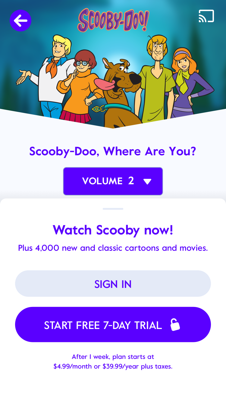
Tapping the banner or an episode thumbnail opens a redesigned paywall. Franchise nicknames are inserted to acknowledge intent, Watch Scooby now!
Confirmed
- The micro-banner reminds visitors that this is a paid service. The paywall — no longer a gotcha.
- Visitors connect emotionally with episode thumbnails. These are the trial-starters.
I would start a 7-day trial, then watch that episode of Bugs Bunny that I wanted to watch.
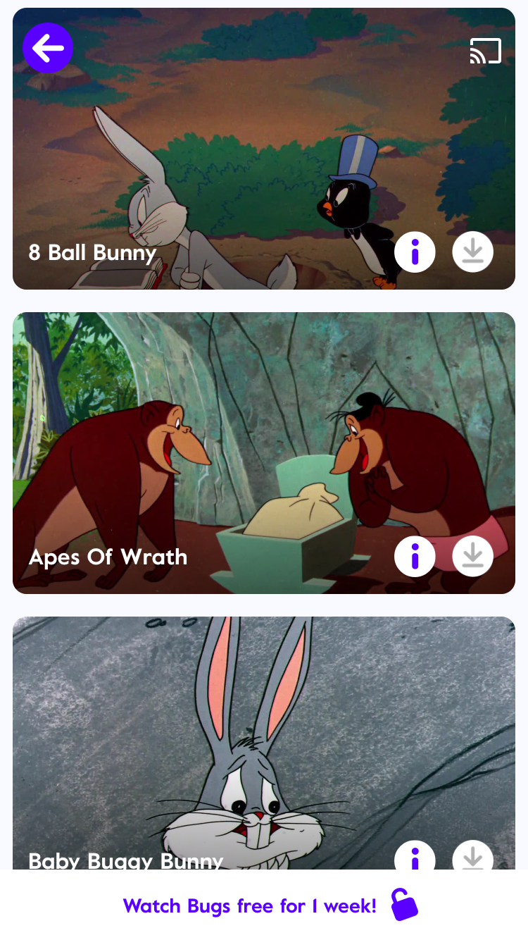
8 Ball Bunny, Apes of Wrath — I remember both of those shows and it brings a smile to my face (laughs).
What’s next?
With Apptimize, we’ll A/B test text and placement variants (micro-banner, slideup).
I’ll define strategies for preview and sign up. These are tied to paywall. Wanting a free trial is easy. Signing up for one — a steep climb.